
When we see a beautifully made flowchart, we tend to believe that the people who have created it are professionals, and they have used flowcharts for years, if not decades. The reality is, everyone can master the art of flowchart creation, as long as they are patient enough, and as long as they pay attention to the details as well as the big picture. Use this step-by-step guide to learn how to create a beautiful flowchart, and how to make it as beautiful and as practical as it needs to be.
1. Think about your goal

To be able to master the art of creating a flowchart, you need to first consider your goal. Even though flowcharts may seem the same, you need to know that depending on the goal you have and the project you’re making the chart for, they will be different.
Do you want to improve an existing process and identify parts where there are issues, do you want to create a chart where you will explain complex processes and make them simple, or do you want to standardize something so that you can give incentives on how to do everything efficiently and consistently? Depending on your answer, you would need to think about the template, the symbols, directions, parts, and everything else. As you can see on this website, there are different types of charts that are used for different purposes, so always have your goal in mind before you start the chart, so that you can make the right decisions from the get-go.
2. Choose the right template
Once you know what you want to achieve with your chart, the next step is creating and choosing a template. You can choose to create your own template, however, if you are new at charts, and if you want to save yourself a lot of valuable time, then the best thing you can do for yourself is to use an already-created template. Depending on the platform that you are using, you will be offered dozens of different templates that you can choose between to create the best for your needs.
One important thing to remember is that every template is customizable, so just because you have chosen to stick to one pattern does not mean that you cannot edit it and make it more personal. Always explored the edit option, and see what you can change depending on the project and your goal.
3. Select the symbols that would best fit your project
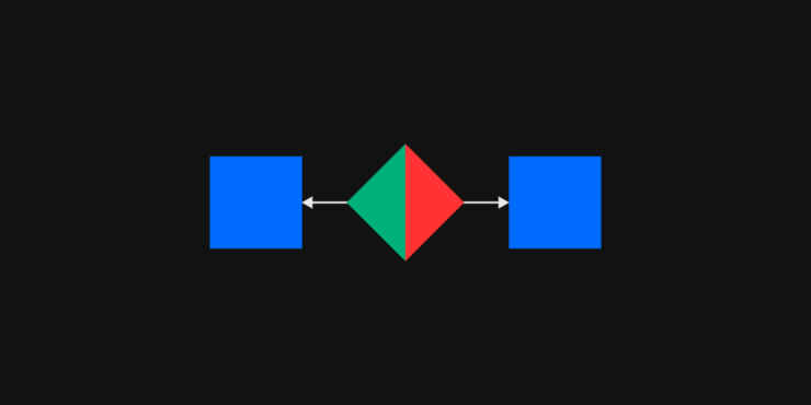
For the next part of the process, you would be choosing the shapes and symbols that you want to add. This is said to be the most interesting part of the whole process, and here you get to start drawing your diagram. It is up to you to decide what kind of diagrams and shapes you want to use, and see how you can combine different parts to make the whole chart easier to understand. Keep in mind that you would need one shape for the questions, the complex and confusing parts, and you would need another one that would lead to answers, suggestions, tips, or something that would simplify the process.
Depending on the platform you’re using to create the floor chart, you can edit them and add them in bulk, or you would need to add them one by one. Depending on how confident you are with creating flowcharts, you can take your time and see what works best for you.
4. Use arrows and lines to make the flowchart make sense
Now you have gotten to the point where you have different shapes and symbols, they are probably filled with some information, but if someone looks at the chart as is right now, chances are, they are going to be confused.
To make things easy to understand you would need to add arrows and you would need to add arrows and lines connecting the different symbols so that the whole presentation makes sense. One thing that you have to pay attention to is the direction of the arrow and the overall flow. This is the part where many people make mistakes, so make sure that you use arrows where needed, that there are pointed in the right direction, and that you use the lines where it makes sense. The right platform for your needs will guide you on how to do this, so make sure that you follow the instructions depending on the platform you’re using.
5. If needed, add decisions, paths, and options
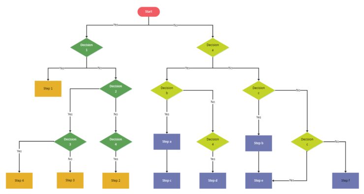
At this point, you may even finish the flowchart. In some cases, once you add the lines and arrows, your flowchart may be completely done. However, if you think that there is something missing, and if you think that you need other things to make the whole presentation look better and seem more cohesive, then you may want to add decisions, pets, and options.
In this case, you may want to split bats, add options, and see what can be done to make the whole thing look better. Your preferred platform should give you the option to do this with ease, so once you add new pads and new decisions, the chart will look better, but it will not mess the things up that you have already done previously.
6. Add, edit, customize, and remove
Finally, you are at the point where the whole chart is already done, so you can just look at the big picture, and see if there is something that you don’t like, if you want to change the lines, the shapes, the overall look, colors, and so on.
This is the part where you just need to worry about the visual representation, you can play around with editing the team, and you can also add relevant icons don’t forget to insert a header, explore if a new background would be a better option, and see if everything is clearly visible and logical.
Once you know that you are happy with what you have created, the only thing left for you is to download your presentation, or share it with others. Keep in mind that even if you notice a mistake later on, it is going to be easy for you to go back, edited, customize anything that you want, and then just download the new version again.